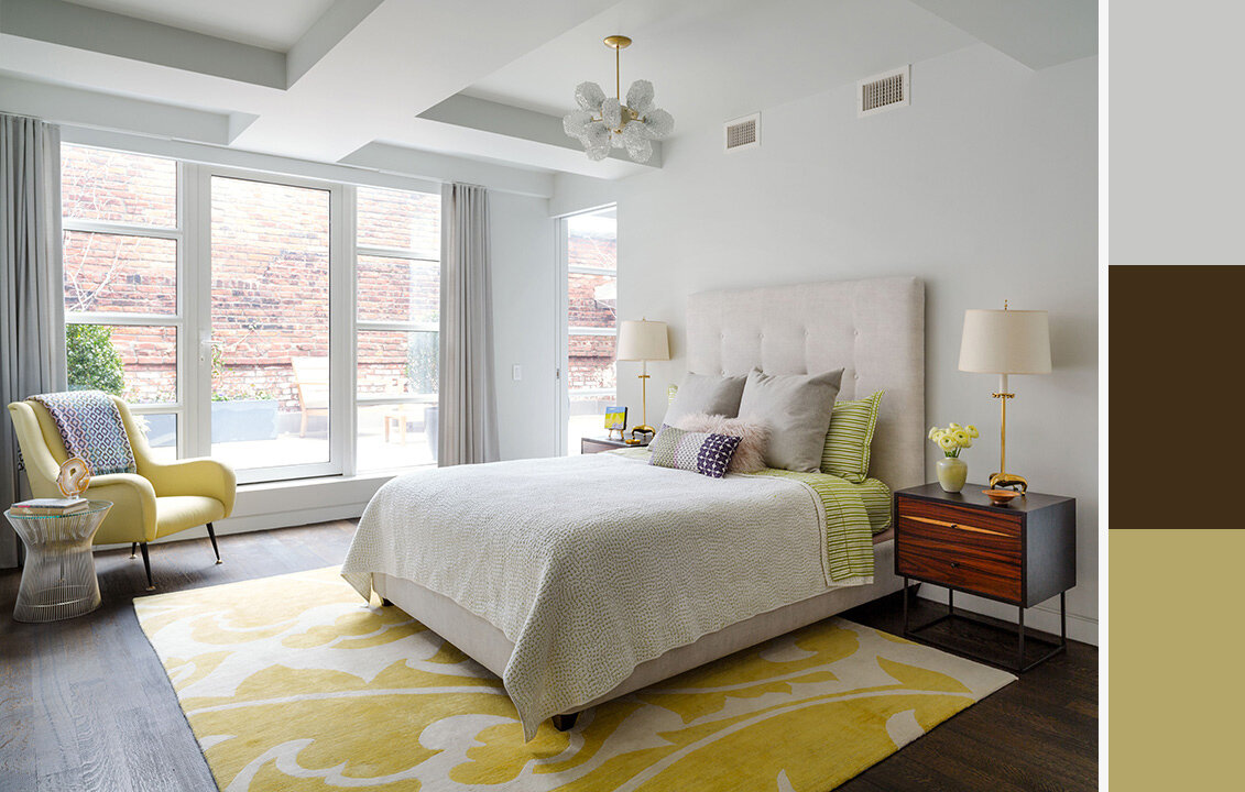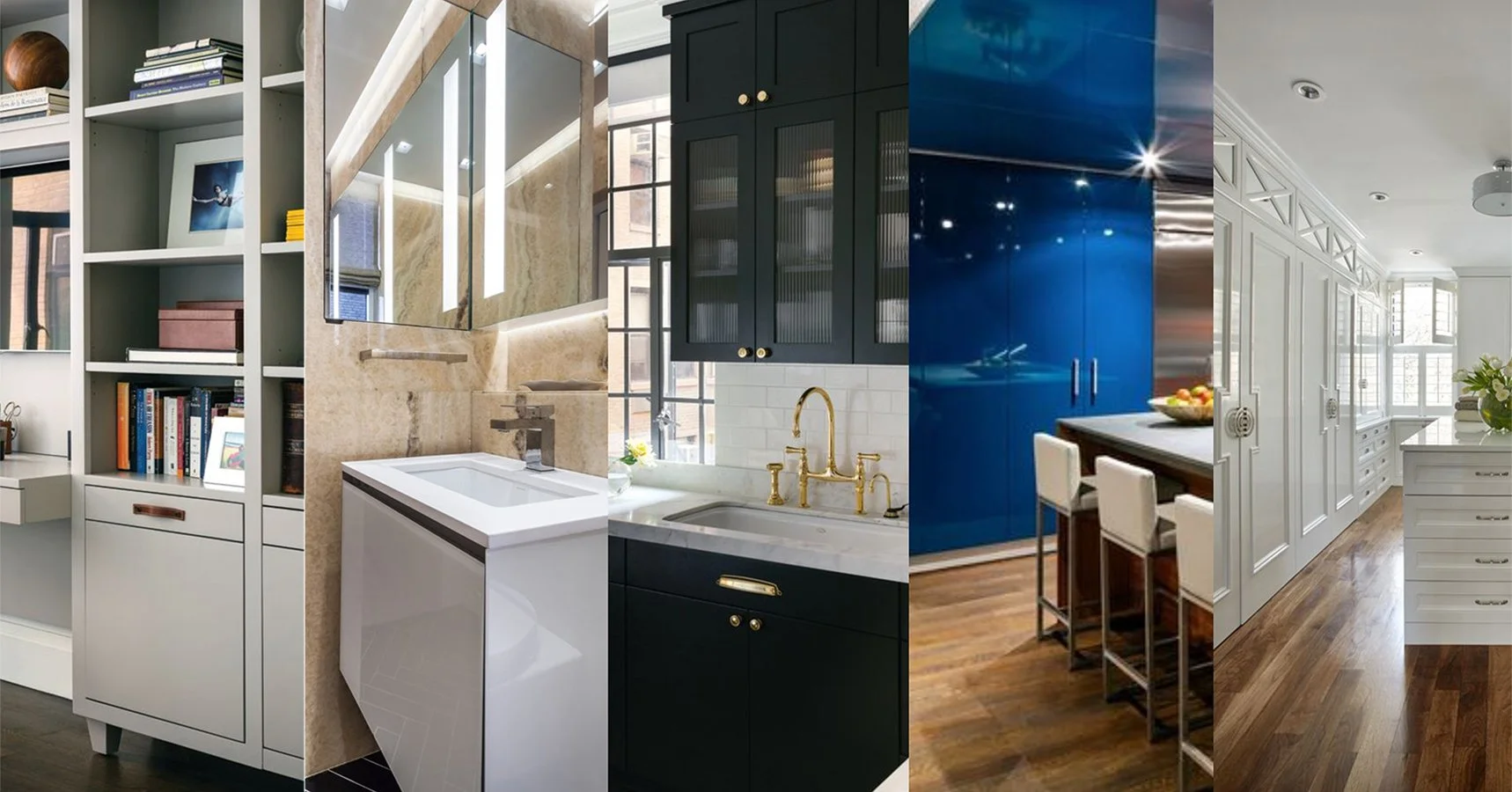

Color has always been one of the most influential elements in interior design. It shapes the atmosphere of a home, highlights architecture, and subtly reflects the lifestyle of the people living in it. Nowhere is this truer than in cabinetry. Whether in a kitchen, bar, dressing room, or home office, cabinet color sets the tone for the entire space.
While many homeowners choose colors based on instinct—what feels calm, warm, or expressive in the moment, design inspiration often comes from broader influences: past “Color of the Year” selections, editorial features in top design magazines, and timeless palettes seen in luxury residential projects. These influences don’t dictate cabinetry design, but they do help illustrate how neutrals and accent colors have remained central to the evolution of high-end interiors.
At Wood & Co, we see first-hand how clients gravitate toward a mix of enduring neutrals and confident color moments. Understanding how these palettes have evolved over time can help homeowners make choices that feel both refined today and lasting for years to come.
How Past Color Influences Shape Today’s Cabinetry Choices
Every year, major paint companies—Benjamin Moore, Sherwin-Williams, Behr, release their “Color of the Year,” often accompanied by curated palettes. While most homeowners don’t follow these announcements closely, they tend to echo broader design themes.
Looking at these selections over the past 10–15 years, clear patterns emerge:
Warm whites and soft neutrals appear year after year.
Deep blues and greens remain staple “statement” hues.
Earthy tones and muted naturals have surged as people seek more grounded interiors.
Moody, near-black hues continue to appear in editorial design projects.
These recurring choices tell us something important: the most successful colors—neutral or bold, are not fleeting. They return because they work. They age gracefully. And in cabinetry, these palettes play beautifully with natural light, stone, wood, and brass—materials that define luxury homes.
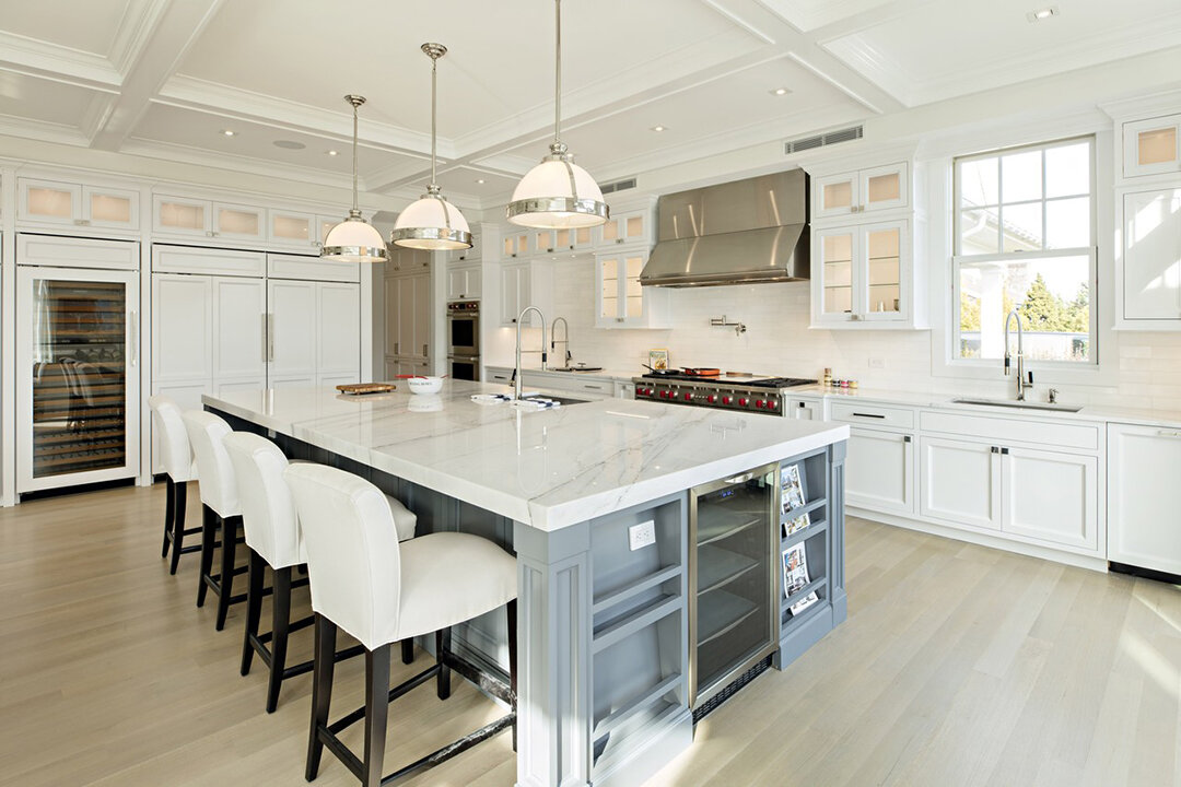
A warm white Hamptons-style kitchen with a bluish-gray island as an accent. Cabinetry by Wood & Co.
Why Neutral Colors Remain the Foundation of Luxury Cabinetry
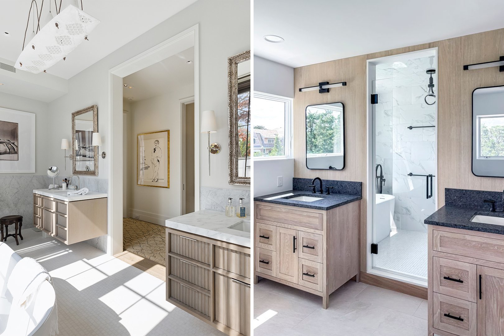
Despite evolving color influences, neutrals maintain their position as the most reliable, enduring choice for custom cabinetry. Designers and homeowners consistently bring them into kitchens, butler’s pantries, walk-in wardrobes, studies, and built-in shelving because they offer unmatched versatility and longevity.
Neutrals Highlight Craftsmanship
Custom cabinetry is defined by detail—paneling, moulding profiles, joinery, and proportion. Neutrals allow this craftsmanship to shine instead of competing with it. A soft white or warm taupe lets the architecture speak for itself.
They Pair Effortlessly with Natural Materials
Luxury homes today feature rich combinations of stone, hardwood, brass, brushed nickel, or hand-finished textures. A neutral cabinet palette becomes the perfect backdrop to these materials.
Neutrals Feel Elevated Across Design Styles
Whether the home leans Coastal Hamptons, Transitional Long Island classic, or a more modern New York aesthetic, neutral cabinetry seamlessly adapts.
They Age Gracefully
A white or greige kitchen installed today will still feel relevant 10–15 years from now. This is why neutrals are considered not just a design choice, but an investment in longevity.
Neutrals That Have Consistently Appeared Across the Years
To illustrate how enduring these tones truly are, several recent “Color of the Year” selections highlight their staying power. Pantone’s 2026 Color of the Year, Cloud Dancer, introduces a soft, elegant white that reflects versatility and quiet refinement. Meanwhile, Sherwin-Williams’ 2026 selection, Universal Khaki, offers a warm, grounded neutral that pairs beautifully with both cool and warm materials—an ideal fit for cabinetry. These choices reinforce why neutrals continue to define timeless, high-end interiors. Hues such as those listed below reflect quiet luxury, precisely what resonates with your clientele.
Warm whites - bringing brightness while avoiding stark coolness.
Soft gray - subtlety that feels polished but not cold.
Greige - arguably the decade’s biggest neutral.
Mushroom or taupe - seen in many European-inspired projects.
Putty tones - subtly warm and incredibly versatile.

A deep dusty purple kitchen with brass trimwork by Wood & Co.
Why Accent Colors Endure in Luxury Cabinetry
Accent colors have long played a meaningful role in cabinetry, not as fleeting design choices but as tones that evolve and refine over time. While annual “Color of the Year” selections shift slightly warmer or cooler from season to season, the broader message remains the same: deeper, richer hues continue to offer sophistication, emotional depth, and a curated feel in luxury interiors. These colors enhance architectural features, bring contrast to neutral foundations, and reflect a growing appreciation for cabinetry that feels expressive yet timeless.
While neutral palettes often establish the foundation of a home, accent colors offer something equally important: depth, character, and a sense of intentional design. Even as annual “Color of the Year” announcements shift from one shade to another, accent hues remain a lasting part of luxury interiors because they bring a level of richness that neutrals alone cannot achieve. Designers turn to these colors not to follow trends, but to introduce emotion, contrast, and architectural emphasis—qualities that elevate custom cabinetry from functional storage to a true design statement.
Just as neutrals highlight craftsmanship and create visual calm, accent colors play a distinct role in shaping the overall mood of a room. Their enduring appeal comes from how effectively they define focal points, anchor special features, and introduce individuality into high-end homes across Long Island and the Hamptons.
They add depth and contrast.
Accent colors create visual structure by drawing the eye to key areas within the room. When paired with neutral perimeter cabinetry, a rich navy island or deep green pantry instantly stands out, adding a layer of sophistication. This contrast helps break up large expanses of millwork, making the entire space feel more dimensional and thoughtfully composed.
They anchor a space architecturally.
Darker or more saturated cabinet colors add visual weight, allowing certain elements to feel grounded and intentionally framed. Tall storage units, appliance walls, or bar cabinetry often benefit from these hues because the added depth helps define the architecture. This anchoring effect is especially useful in open-concept homes, where color can help organize different zones while still maintaining overall cohesion.
They elevate special moments in the home.
Accent colors allow designers to highlight areas that deserve attention. A built-in wine cabinet wrapped in a deep forest green, a library finished in charcoal, or a moody home office painted in aubergine communicates that these spaces are meant to be experienced—not merely passed through. The right color choice can transform a functional cabinet into a feature that expresses refinement and intention.
They feel personal.
Accent cabinet colors often reflect the homeowner’s style—whether that’s bold and expressive or understated but distinctive. These hues introduce individuality without overwhelming the home, especially when balanced with a primarily neutral palette. The result is a space that feels custom, curated, and deeply connected to the homeowner’s identity.
Accent Colors That Have Proved Their Staying Power
Past “Color of the Year” selections also reveal a long-standing appreciation for rich, expressive accent colors. Benjamin Moore, in particular, has consistently highlighted tones that translate beautifully into cabinetry—Classic Blue (2020), Aegean Teal (2021), and October Mist (2022)—each offering its own balance of depth, calmness, and sophistication. These choices show how accent colors evolve over time while maintaining the richness that designers and homeowners gravitate toward in high-end interiors.
Navy - iconic and elegant.
Deep greens - natural and earthy, ranging from forest to muted sage.
Charcoal - moody yet surprisingly versatile.
Muted burgundy or aubergine - seen in European luxury projects.
Terracotta or clay - warm, textural, and subtly dramatic.
These shades continue to stand the test of time not because they are trendy, but because they offer emotional depth, architectural presence, and a sense of intentional design—qualities that elevate custom cabinetry in any setting.

Dusty blue bath vanities pair well with the mostly white and gray architecture in this master bath by Wood & Co.
How Designers Blend Neutrals and Accents Over the Years
Color isn’t chosen in isolation—designers weave it into the architecture, the light, and the rhythm of the home. In luxury interiors, the real magic happens when neutrals and accent colors work together, creating a layered palette that feels intentional, atmospheric, and deeply connected to the space. This balancing act is something you’ll see repeatedly in the most celebrated homes featured in Architectural Digest or Elle Decor: a refined interplay between calm foundations and confident color moments.
Blending these palettes is not about being cautious. It’s about creating movement, contrast, and emotion—inviting the eye to travel through the space and revealing details that might otherwise be overlooked.
TIP #1: Establish a Neutral Base First
A neutral foundation isn’t just safe—it’s strategic. Designers rely on quiet tones to ground the space, allowing architectural details and custom millwork to shine. A warm white or refined taupe creates a visual canvas that stays relevant for years, even as color influences evolve. This base brings clarity to the home, making every accent color feel more pronounced and deliberate.
TIP #2: Introduce Accent Colors with Purpose
Accents act like punctuation marks—used sparingly, they give the entire room structure and movement. Designers don’t add bold colors randomly; they place them where the eye naturally lingers. Certain cabinetry zones can carry deeper hues because they already function as focal points:
Islands that anchor the kitchen
Home bars that signal a moment of indulgence
Custom range hoods that draw the eye upward
Tall pantry units that act as architectural pillars
Home office built-ins that define a work-ready environment
These touchpoints become opportunities for personality and atmosphere, adding richness without overwhelming the space.
TIP #3: Allow Architecture to Lead the Color Story
Great designers let the home speak first. They study its proportions, curves, and lines before choosing a color.
An arched opening feels dramatic and sculptural in a deep tone.
A hutch-style cabinet in a muted color becomes an elegant furniture piece.
A floor-to-ceiling appliance wall painted in charcoal suddenly feels like architecture, not cabinetry.
Accent colors reveal the home’s best features—highlighting craftsmanship, shaping transitions, and elevating moments that deserve attention.
TIP #4: Consider Lighting, Scale, and Material Pairings
Color is deeply influenced by its environment. What looks moody and luxurious in a bright Hamptons kitchen may feel heavier in a dim apartment, and designers adjust accordingly. They consider:
Natural light across different times of day
Ceiling height and openness
Texture and temperature of nearby stone or wood
Reflectiveness of finishes and metals
This careful calibration ensures the palette remains warm, harmonious, and visually balanced—no matter the home’s scale or setting.
Final Thoughts
Cabinet color palettes evolve slowly and intentionally—not through trends, but through the lasting values of good design: balance, proportion, lifestyle, and architectural integrity. Neutrals remain the foundation of luxury cabinetry, offering calm, versatility, and timeless appeal. Accent colors enrich the home, adding depth and personality while honoring the craftsmanship of custom millwork.
Looking at past “Colors of the Year” and editorial influences helps us understand one simple truth: the most enduring cabinet colors, whether quiet or confident—are those chosen with intention.
At Wood & Co, we help homeowners explore these palettes with clarity, ensuring their custom cabinetry feels meaningful, cohesive, and beautifully built for the life they live today—and for years to come.