Color has always been one of the most powerful ways to shape the feel of a space. It can make a room feel calm and understated, bold and energetic, or warm and inviting. It is also one of the clearest ways to express personality and create interiors that feel layered, intentional, and memorable. But while color can completely transform a room, it can also be difficult to get right, especially when working with multiple shades at once.
We constantly see beautifully curated interiors across magazines, Pinterest, and Instagram, and wonder why certain palettes feel so effortless and cohesive. In reality, successful color schemes are rarely random. Without a clear sense of balance, it is easy to fall back on safer combinations like all-neutrals or a single accent color paired with white.
The good news is that creating a balanced palette does not have to feel intimidating. There are simple design principles that can help bring structure and harmony to a space while still leaving room for creativity. One of the most well-known is the 60-30-10 rule or 3-color rule, a straightforward guideline for building balanced and visually dynamic interior color schemes.
What is the 60-30-10 Rule or 3-Color Rule?
In refined interiors, color is never accidental—it is curated. The 60-30-10 rule or 3-color rule is foundational principle used to create spaces that feel composed, harmonious, and visually balanced. Its application isn’t limited to just interior design, but also for other disciplines such as marketing, graphic design, and even floral arrangements. Rather than overwhelming a space with excessive variation, this approach allows materials, craftsmanship, and architectural details to stand out—resulting in interiors that feel timeless and elevated.
How to Apply the 3 Color Rule in Interior Spaces
The 3-color concept adds structure and visual heirarchy to any given interior. At its core, the rule limits a space to three primary tones:
60% - Dominant Tone
The dominant tone or color holds the largest share of your space. It is typically expressed through walls, flooring, or large built-in elements, establishing the visual foundation of the space.
30% - Secondary Tone
The secondary tone or color introduces depth and contrast to your space. It’s commonly introduced through upholstery, cabinetry, or millwork to create depth and variation without overpowering the palette. Depending on the size of your space, you can also apply the 30% color to the floor or an accent wall.
10% - Accent Tone
The accent tone adds character and focus to a space. This can be a bolder or a contrasting color compared to the previous two, and helps break the monotony in a given area. It’s applied selectively through décor, textiles, artwork, or statement pieces to create visual focus.
In interior design, these tones extend beyond just simple paint colors. You can also use material palettes such as wood, stone, textiles, and metal finishes—creating a more textural interpretation of the rule. Once proportion is established, the result naturally feels more visually grounded and cohesive.
Photo by Helena Lopes on Unsplash
How to Choose Your Colors
Choosing an interior color palette begins with a clear point of reference—often a material, architectural feature, or statement piece. Instead of selecting colors independently, each tone should visually relate to the others to create a connected composition. Here are some ways you can approach creating a color palette:
Starting With Your Dominant Color. As it will be the largest percentage of your space, your dominant color often also dictates the mood of your space. What do you want your space to feel like? If you want a space that feels calm and airy, colors like white and beige will serve you well. If you want a more intimate and moody space, dark browns or a deep red are great candidates for a dominant color.
Build On Top of a Reference Point. If you have specific items your really love, such as a large collectable painting, a prized heirloom, or statement furniture piece, then you can use that as your reference point. Choose colors and materials that will complement, not clash, with your chosen piece. For example, if an artwork features reds and oranges, then you can lean other similar warm tones for the rest of your space.
Using a Color Wheel. When you already have one color to start with, a color wheel can help you decide what your other colors would be. Analogous colors are next to each other on the wheel, creating visually soothing spaces. Complementary colors are on opposite ends of the color wheel and work great in creating a fun and vibrant space.
Additional Factors to Consider
It’s not enough to build a color palette from a few swatches or a mood board.
Undertones & Lighting
Natural and artificial lighting can significantly affect how colors appear throughout the day. Evaluating undertones and lighting together helps maintain consistency across the palette.Varying Material Textures
Layering finishes and materials adds dimension while keeping the palette visually restrained. But when overdone, even all beige can look busy when you have too many different different patterns and textures.Balancing Neutrals and Focal Points
Decide how much focus you want to place on certain pieces. A brightly colored painting or statement furniture piece will be more impactful when surrounded by a limited palette of neutral tones.Reducing Visual Clutter
Clean organization and concealed storage help preserve visual clarity, allowing the palette to feel more refined. An overabundance of stuff can ruin even the most well-curated color palette.
Examples of the 60-30-10 Rule
One of the best ways to learn is through examples. Don’t worry. We have you covered. Below we’ll look at some well-designed interior spaces, and go over how it applies the 60-30-10 rule.

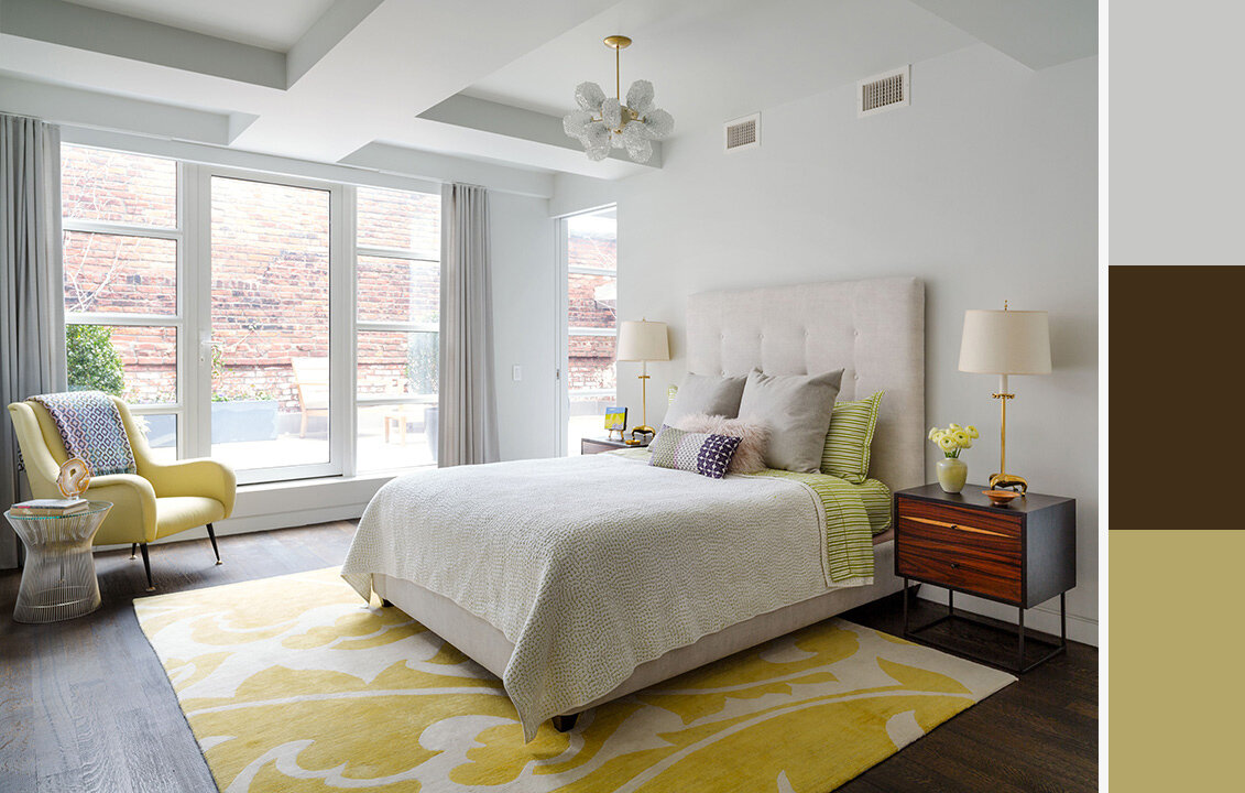
White bedroom with dark wood flooring and yellow accents by Wood & Co.
In this bedroom we can easily see how the 60-30-10 rule is applied. The main color is white, which we see on the walls, ceiling, windows, and draperies. The very light cream color of the bed headrest, linen, and lamp shade also count as being part of the main color. This is because, in the context of the whole room, the lightness of the cream is very close to white. You can also think of it as “light neutrals” being the dominant hue in the room. It’s also present in the details of the area rug. The secondary color is the dark wood finish, which is applied to the floor, the bedside tables, and the accent chair’s legs. Lastly, the accent color is yellow. Pastel yellows are used on the arm chair and the rug. Also notice how the lamps and chandeliers have gold stems –more subtle ways to add the accent color in the space. Using this palette, the interior designer was able to create a calm and relaxing space, but still brimming with brightness and personality.

Living room with white oak walls and flooring by Wood & Co.
Unlike the previous example, this living area has its main color both on the walls and floor. It’s also present in the draperies, sides of the arm chairs, and the ottoman seats. The secondary color, blue, is used on large pieces such as the sofa and the area rug. It’s also used on the fireplace to break up the monotony of the wall. Red is then used as the accent color, and is used sparingly. It’s only present on the two arm chairs and on the table décor. Another point of interest in this space is the use of transparent items such as the two lamps and the coffee table. Because they’re see-through, they don’t clash with the existing color scheme.
Why the 3-Color Rule Creates Balanced Spaces
A well-designed interior often feels effortless because every element works together visually. Limiting the palette to three core tones creates clarity and allows materials, textures, and architectural details to stand out more effectively.
This approach helps achieve:
Visual continuity across furniture, finishes, and architectural elements
Greater emphasis on materiality and craftsmanship
A calmer atmosphere with less visual noise
The 3-color rule creates structure and restraint—helping spaces feel layered without appearing overwhelming.
When to Break the 3-Color Rule or 60-30-10 Rule
In interior design, rules often serve as a foundation rather than a limitation. Design is limitless, and so are the ways you can adapt the 60-30-10 rule to suit your own home. Some spaces successfully move beyond three colors. Some spaces can work with less. But only when the palette remains visually connected.
Ways to expand beyond the 60-30-10 Rule:
Vary the proportions to achieve different effect. Increasing the proportion of your dominant color to a 70-25-5 split can make a space feel more calm. Conversely, scaling it down 50-35-15 can create a more vibrant and playful space.
Introduce additional accent colors. There’s no need to limit yourself to 3 colors as long as you preserve a clear visual hierarchy. Proportions such as 60-30-5-5 or 55-30-10-5 lets you express more of your personality while staying cohesive.
Go monochrome by layering tones within the same color family. Applying the 60-30-10 rule to shades of a single color lets you keep to a limited palette without your space feeling one dimensional.
Add variety through texture. Large swathes of plain color can make your space look flat. For example, a dominant color of beige doesn’t have to be limited to plain solid painted walls. You can add dimensionality with warm marble or travertine stone, naturally stained white oak furniture, or patterned beige textiles and linen.
Remember that design “rules” are more of a guide than strict law. Don’t let it limit your creativity and personal expression. Refinement comes from cohesion, not the number of colors used.
Adding Color to Your Home
While the 60-30-10 rule isn’t the only way to decide your home or room’s color scheme, it’s still a helpful tip to keep in mind. The 3-color rule is a framework for clarity, restraint, and thoughtful composition—allowing materials, finishes, and architectural details to work together seamlessly. When applied well, it creates interiors that feel intentional, layered, and enduring.
At Wood & Co., this philosophy extends beyond color selection into the craftsmanship of each space. Custom cabinetry, millwork, and tailored finishes allow palettes to be expressed with precision—ensuring every dominant, secondary, and accent tone feels fully integrated within the home. The result is an interior that feels refined, cohesive, and intentionally crafted.
Note: This article was originally published August 6, 2021. It was last updated on May 29, 2026 to refresh its contents and include additional information.